X
Welcome to Ceramic Review
Ceramic Review is the magazine for contemporary and historical ceramics, ceramic art and pottery.
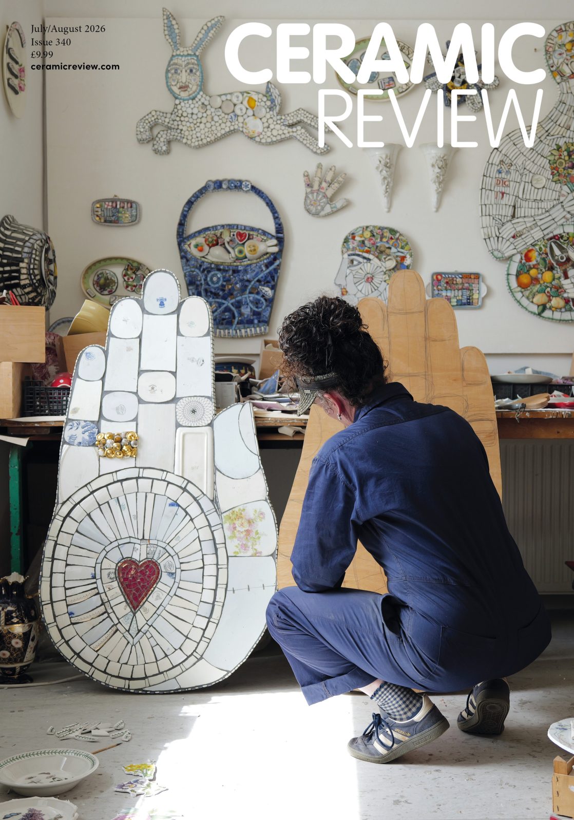
Ceramic Review Issue 340
July/August 2026
Ceramic Review is the magazine for contemporary and historical ceramics, ceramic art and pottery.
July/August 2026
Corinne Julius visits Frances Priest’s exhibition at Blackwell, the Arts & Crafts House in the Lake District, and is greeted by work that reflects the patterns and architecture of its surroundings
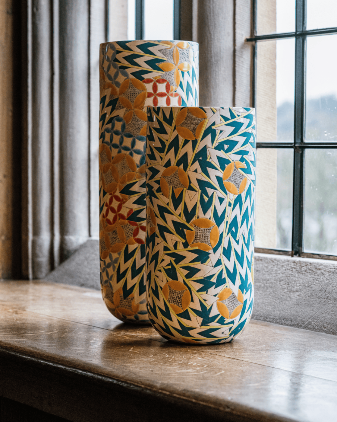
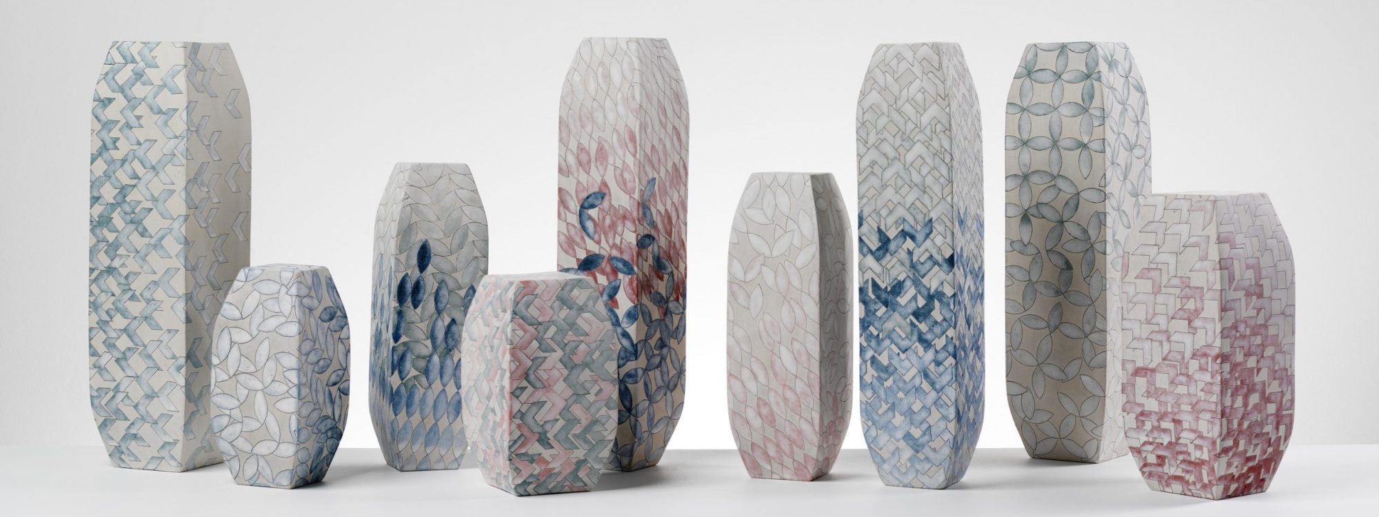
Frances Priest is an acknowledged master of pattern, line and colour. Her interest in ornament stems from The Grammar of Ornament (1856), Owen Jones’ seminal book on pattern, which was a childhood gift from her parents. For a child obsessed with colouring-in on graph paper with felt tip pens, it was transformative. Today, Priest is associated with bold, geometric designs usually etched into vessel forms or transposed onto encaustic tiles.
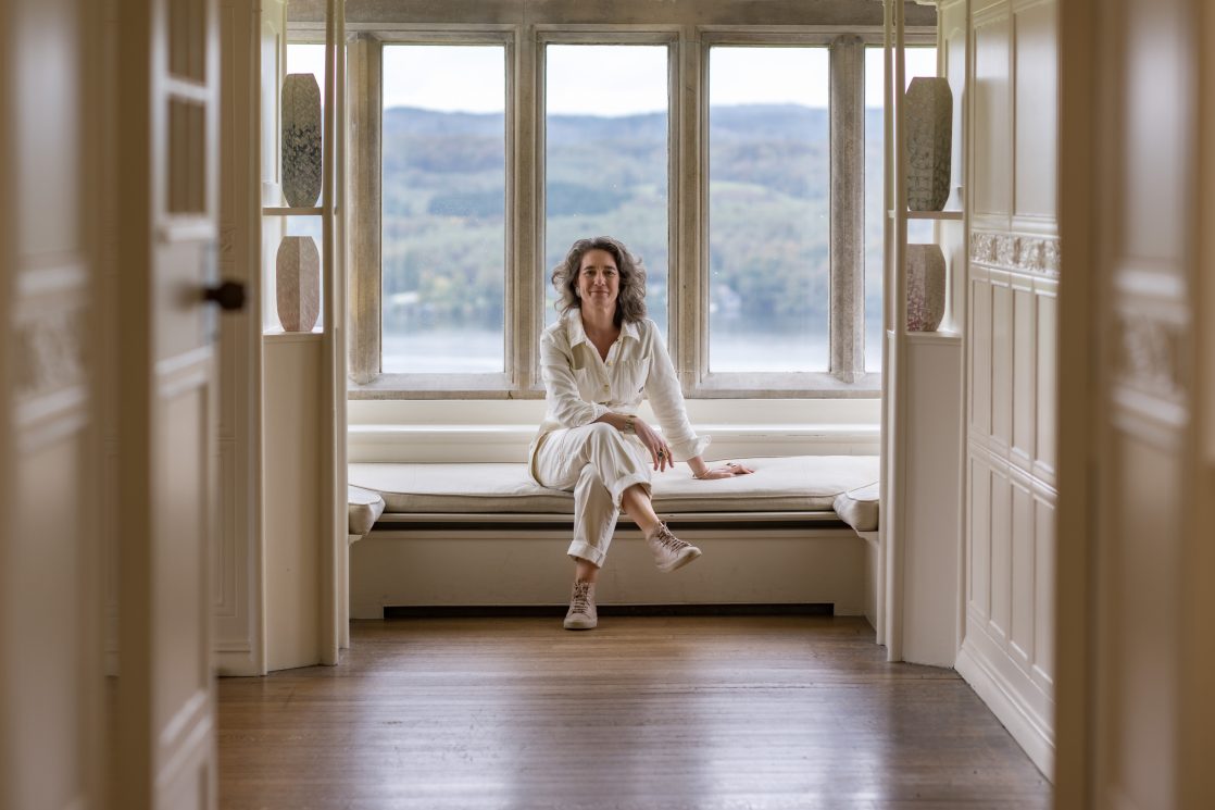
Currently, she has taken possession in a minimalistic way of the magnificent Blackwell, the Arts & Crafts House on the shores of Lake Windermere in the Lake District National Park. Most artists who are let loose to make work in response to a particular environment opt for the monumental; not Priest, her interpretation is gentle and delicate, responding sensitively to the design but also the ethos of the house, which was designed by Mackay Hugh Baillie Scott as a family holiday home for the Manchester brewing magnate, Sir Edward Holt. Much of the design of the house comes from the architect’s submission in 1900 to the ‘House for an Art Lover’ competition, in which he was the most highly commended. Priest’s new works relate to his watercolours for that competition.
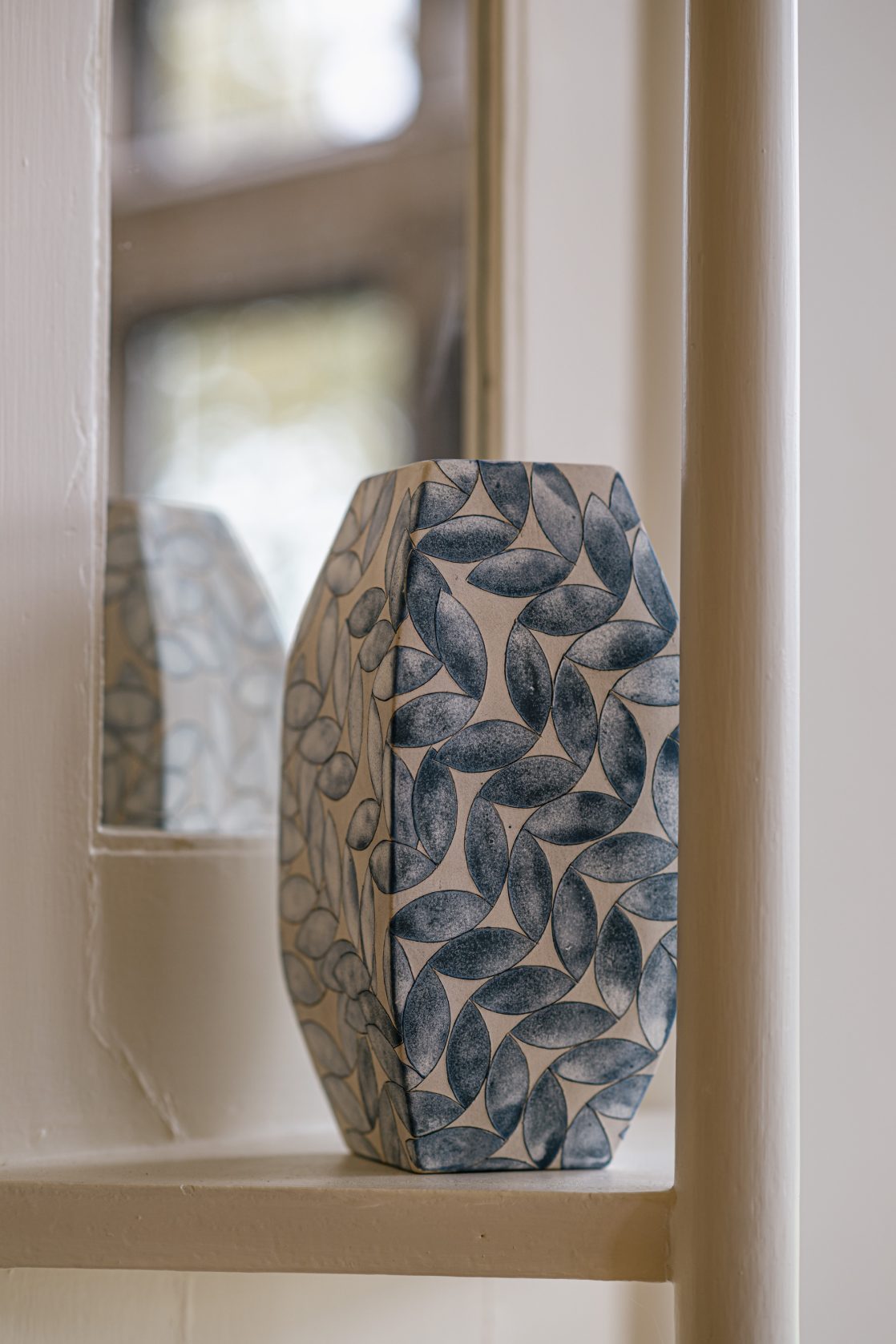
These works are placed with great care in the White Room. It is, as its name suggests, a white room, where the decoration is in the form of a moulded gesso ceiling and frieze, featuring local flora, especially the rowan, an element of the Holt family crest. The light, airy space reflects the colours of the lake and sky, something to which Priest has responded, relating her patterns to the light hitting the water, the passing clouds and how they intercede into the room.
SENSITIVE RESPONSE
Priest’s colours can often be forceful, here they are delicate, almost pastel and gentle, with flashes of red and blue reflecting Baillie Scott’s watercolours. The soft shades of a tulip-decorated stained-glass window are picked up in an adjacent sculptural form. Sitting in the window seat, her forms are carefully placed to distract the viewer from the landscape. ‘At Blackwell,’ as Priest puts it, ‘you get a sense of the ornament growing and moving through the spaces.’
The exhibition starts in the broad, wood-lined corridor, continuing into a large wood-panelled room. Priest, who mostly undertook the project without a curator, has thought carefully about where to place her works. An early large work entitled Shift 1, composed of matching black and white curved forms, is placed against a stained-glass window where the sweeping pattern echoes its shape. In the largest reception room, a huge Gathering Bowl, a press-moulded and carved ceramic vessel with incised hand drawing, that is hand-painted, glazed and with enamel transfers, sits in solitary pride of place on the table; tall solid cylindrical forms rest on the piano.
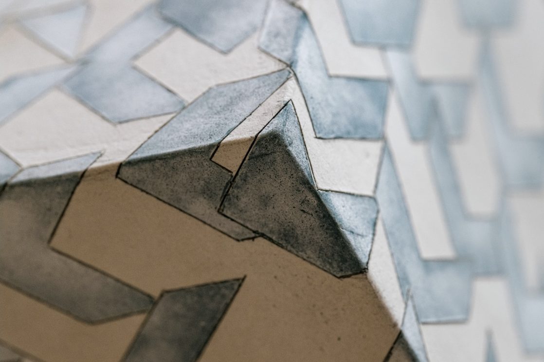
These pieces are derived from her meticulous drawings – the core of Priest’s work – which she applies to simple forms, using them as three-dimensional canvases for decoration. Her drawing Untitled Study, 2024, which features turquoise ellipses shapeshifting on a creamy ground, hangs in the gallery.
Most of Priest’s pieces are hand built with clay and the use of plaster moulds. Once the clay has hardened, she etches into the surface with her own specially designed tools. The form is then bisque-fired and an oxide wash is applied before being wiped away again, leaving the colour only in the incised lines. She then painstakingly paints and fills in the outlines of the designs using vitreous slips and glazes, resulting in the brilliant colours and textures for which she is renowned.
TRANSITIONAL PATTERNS
The starting point of her new Unfixing series, commenced during a residency at the Hugo Burghe Foundation, is accompanied by a collaborative sound piece made with Simon Kirby. The colours, forms and compositions of the series grew from her observations of the isolated environment in the Borders, as well as historic tiles.
The vibrant series is shown in more detail upstairs in one of the final two rooms of the show. On these pieces her ornamental motifs break loose from their structure, and seem to float across their ceramic or paper backgrounds, gathering in new patterns.
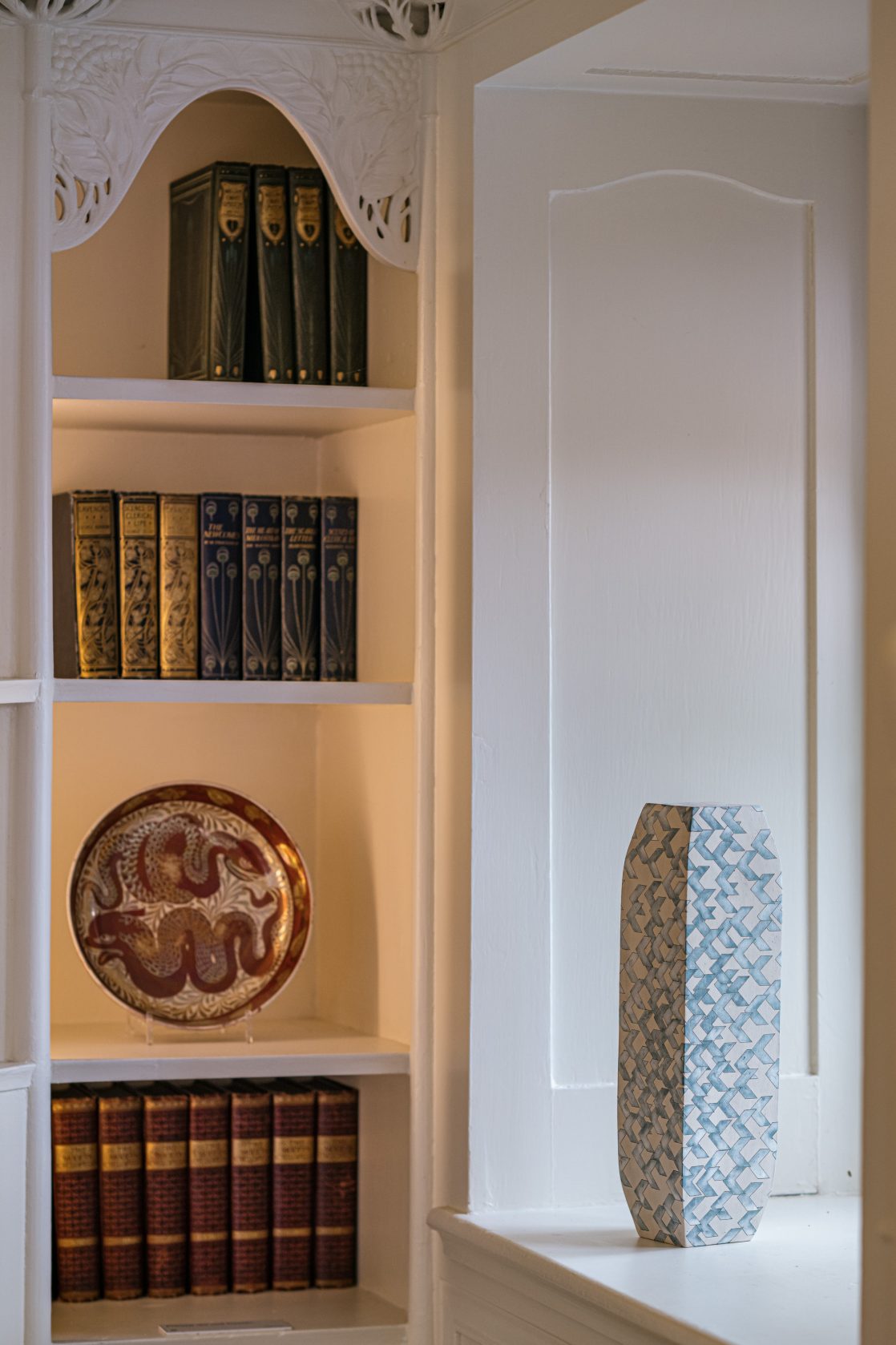
They are shown in the two retrospective rooms of the exhibition, alongside a chronological display of Priest’s work marking clearly her development, which started with a project on Raasay Island in Scotland. In the corridor shown on a long sideboard is Patterns of Flora – Mapping Seven Raasay Habitats, 2015. The seven vases demonstrate Priest’s interest in nature and the transition of her patterns from the more literal to the geometrically abstracted.
In a second space are her Imbrication vase and disc forms of brightly coloured inscribed ceramics with glaze and vitreous slip made for Future Heritage in 2022. Accompanying them is her generative animation made with Mark Daniels and Sam Healy. Here her love of pattern runs riot in a never-repeating series of changing forms that glide and overlap across the screen.
Priest thrives on collaboration, be it her early New Manor Ware, created in 2012, black and white tableware made in collaboration with community groups at Yorkshire Artspace, tiles produced with Craven Dunnill Jackfield, her Tiled Corridor at the Royal Edinburgh Hospital in 2018, or her Chelsea Flower Show tiles for Down’s Syndrome Scotland.
MAGIC IN MATERIALS
The final rooms of the show are extremely instructive. They explain Priest’s development. However, placing this explanation and retrospective element almost hidden upstairs at the end of the exhibition, I feel is a wasted opportunity. For those who know Priest’s work, it is informative of her progress, but first-time viewers would have benefitted greatly from having seen this at the beginning. This was not Priest’s decision but apparently caused by the configuration of the rooms. However, I believe it would have been helpful if Lakeland Arts curatorial staff had found a way of making an earlier display possible as this would have greatly enhanced visitors’ understanding.
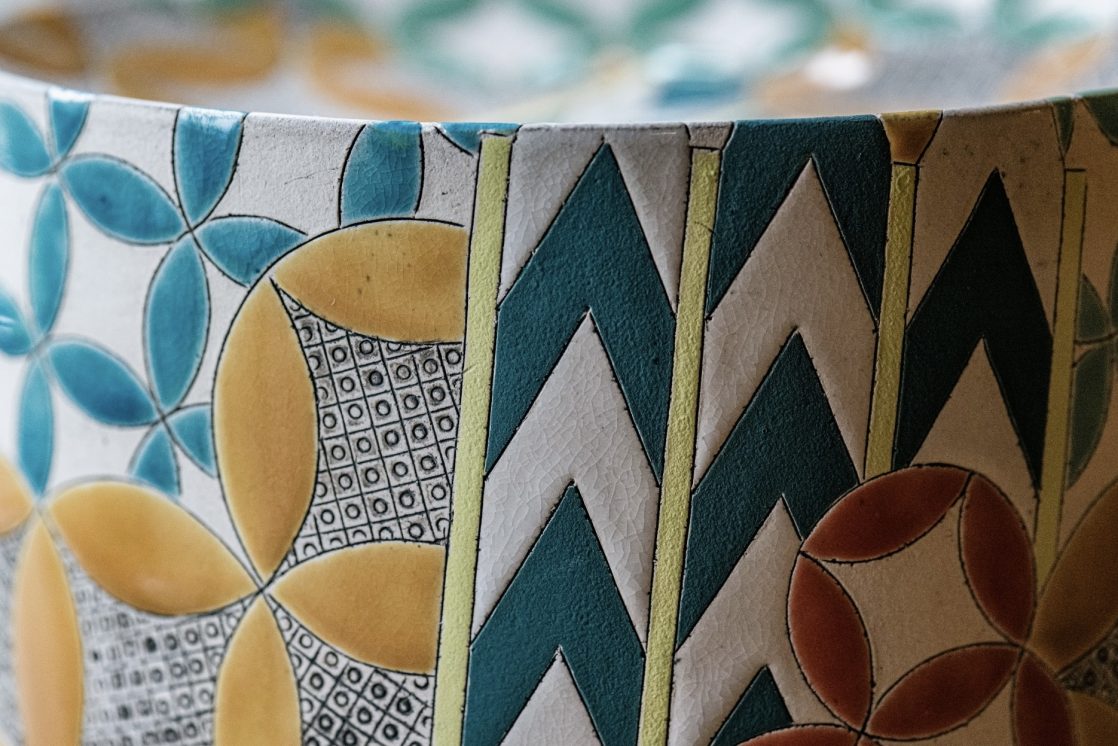
Overall, Priest uses the house as a stunning backdrop to her work. Her love of pattern is paramount. Her work has the feel of complex marquetry or elaborate embroidery, displayed on the simplest of elegant forms. The patterns become jewel-like, drawing the viewer into a highly structured geometric world of colour and ornament.
Priest said in 2024: ‘Of all the ways a human can spend their days, seeking out beauty and magic in materials feels vital and fragile, a huge privilege, a comfort, and an act of slow defiance in the face of seismic changes.’ She has done just that for the viewer’s enjoyment.
Frances Priest: Motif | Line | Colour, until 11 April, Blackwell; lakelandarts.org.uk/blackwell
Ceramic Review is the international magazine for contemporary and historical ceramics, ceramic art and pottery.
As a subscriber to the print magazine, you also get FREE access online to the entire Ceramic Review archive – going all the way back to our first issue in 1970. Digital subscriptions are online only.